| Time |
Event |
| 12:15a |
Map of Denali Nat'l Park (1994) |
| 12:48a |
Map of the United States as an Eagle (1833) |
| 1:17a |
West Bank Attacks by Israeli Settlers by Governate (January 2024 to June 2025) |
| 1:48a |
Map of all the disputed territories around the world. |
| 5:37a |
This is the world map according to fish |
| 6:05a |
Administrative Divisions of German Customs Union 1864-12-01 (remake) |
| 6:30a |
Map at school forgot New Zealand |
| 7:48a |
The actual size of Africa |
| 8:18a |
Pornstars per million inhabitants (Europe) |
| 9:31a |
High speed rail in Europe by country |
| 10:50a |
Visualization of the approximate movement of aerial targets over the territory of Ukraine on the night of 2025-10-5  | The "paper tiger" that NATO won't dare send troops against carried out a large strike last night, one of dozens of such similarly large scale strikes this year.
[link] [comments] | |
| 10:50a |
Map of China (PRC) in 1952  in 1952") | Source: Library of Congress https://www.loc.gov/resource/g7820.ct004239/?r= -0.374,-0.474,1.111,1.67,0 The map was published in Shanghai by Ya Guang Yu Di Xue She in 1952. It shows Chinese territory following the claimed territory by the Communist Party of China at the time (1952) which asserts sovereignty over all former Qing Dynasty or Republic of China (I'm not sure which one) territories. This includes: Mongolia Western Pamir Arunachal Pradesh /South Tibet Northern Burma // Wanting? Taiwan A map similar to this was also shown in a Chinese movie which I had recently watched (The Volunteers: To The War). Where a map of the PRC included the aforementioned territories above was shown.
[link] [comments] | |
| 10:50a |
Percentage of people aged 18 and older who are obese |
| 10:50a |
Today's air attack on Ukraine.  | One of the most massive combined strikes on the territory of Ukraine. In every region of Ukraine, missiles/drones were flying. According to personal information, the following were used: (Yellow) More than 700 UAVs of various types. (Green & Red) Up to 50 cruise missiles "Kh-101", "Kalibr" from Tu-95MS bombers, missile carriers from the Arctic Ocean Fleet. (Blue) 2 aeroballistic "Kinzhal" missiles from MiG-31K fighters. The main strike directions are Lviv, Lviv region, Zaporizhzhia, Odesa.
[link] [comments] | |
| 11:16a |
Map-engraved powder horn, 1759  | Displayed at the Met, this horn by one Peter Myers is engraved with the British coat of arms, and a map of the forts in the Hudson and Mohawk valleys.
[link] [comments] | |
| 11:16a |
1986 map showing the Soviet Military Forces |
| 12:32p |
Largest foreign group in each region of Finland ???????? [2024] ![Largest foreign group in each region of Finland ???????? [2024]](https://preview.redd.it/yt4eb5u5k9tf1.png?width=640&crop=smart&auto=webp&s=a9a670b969f385d39e75151dbebf470d9583acf9 "Largest foreign group in each region of Finland ???????? [2024]") | Data from : Tilastokeskus Official Government Statistics Map made in quikplots.com This map is made with the latest data I found (2024) I chose the "Country of birth according to age and sex by region, 1990-2024" data set. Where age was removed as a variable and sex was chosen as Total (Both M and F) After exporting into Excel, I excluded the former states of Serbia & Montenegro, Yugoslavia, Czechoslovakia, and The Soviet Union. The largest groups were found using conditional formatting to highlight the largest value. If you want the cleaned data set you can DM me, I'll send you my Excel sheet!
[link] [comments] | |
| 12:33p |
Countries where majority of population can speak a language originating in Europe |
| 1:48p |
Map of the 32 counties of Ireland with their literal English translations |
| 1:48p |
In regards of geographical position a relatively accurate map showing there some well-known British bands/artists hail from. |
| 2:15p |
How West Berlin appeared on a 1988 East German Map |
| 2:47p |
Europe in the Age of Absolutism (Borders as of 1740) |
| 4:03p |
2025 Czech parliamentary election | Results by region |
| 4:33p |
Map of Data Centers Across the USA |
| 5:47p |
Cousin marriages in India |
| 5:47p |
All proposed boundaries for Guyana |
| 6:21p |
Minimum voting age by country |
| 7:33p |
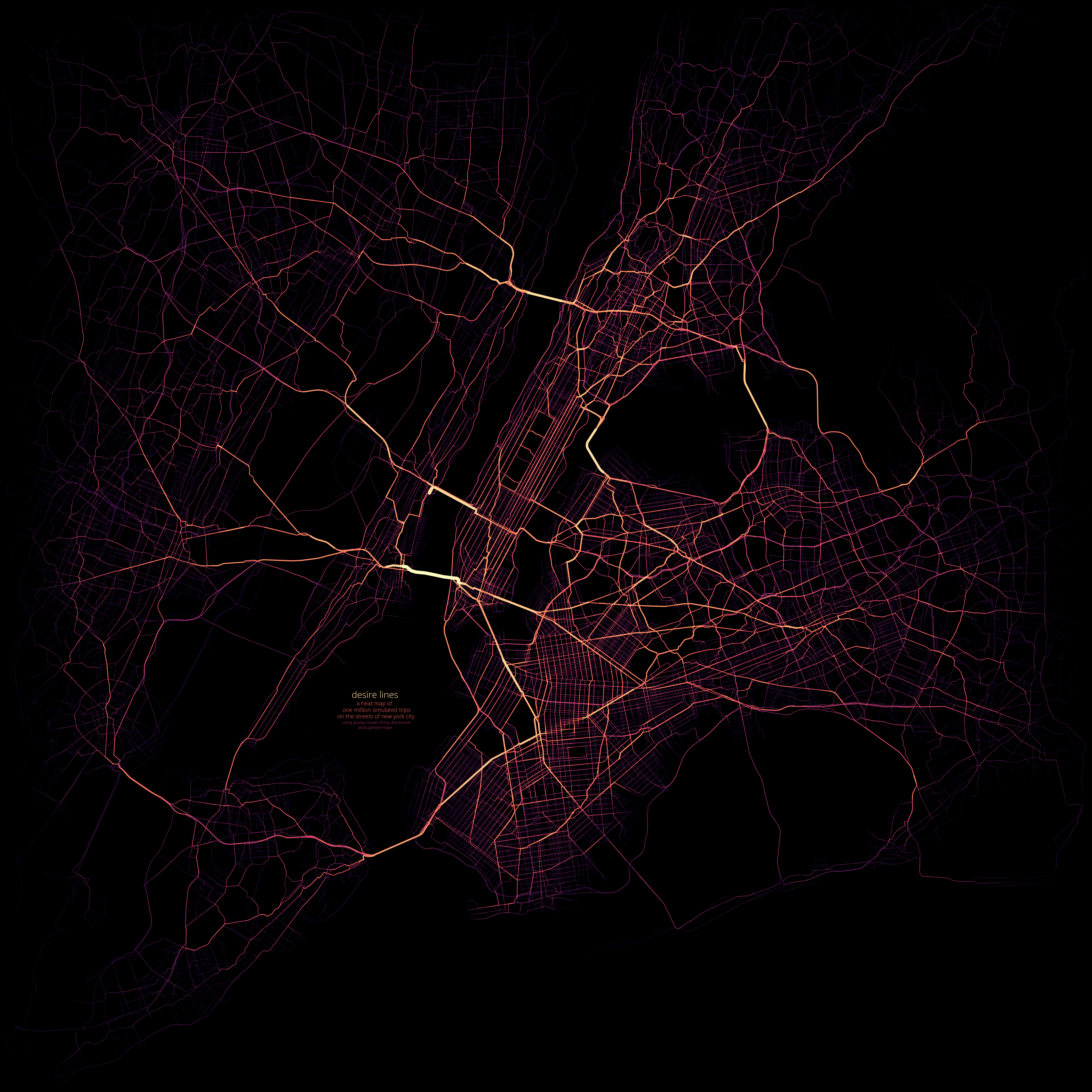
Heat map of one million simulated trips on NYC area streets  | higher res version here! anita.garden/assets/nystreets.png this is the result of repeatedly picking pairs of random points and pathfinding between them, and plotting the streets according to how often they were used. the pairs of points are selected according to a gravity model. this means the probability of a pair of points being selected is proportional to their nearby population densities (geometric avg) and also proportional to the inverse square of the distance, so that short trips are much more frequent than long trips. the street data is from openstreetmap, fetched with the OSMnx package. the population density data is from kontur, at a 400m resolution. drawing was done with matplotlib. the code was partially vibecoded. you can see the code here. i'm currently working on a version that includes the subway! my other maps can be seen here: anita.garden/maps
[link] [comments] | |
| 7:33p |
Trans-Sahara: Trade, travel and water sources. A detailed map on how caravans crossed the Saharan desert, complete with water sources and travel times.  | During my 10 years of making trade routes maps, I have depicted the Trans-Saharan trade two times. But I always had a nagging realization that i never did it any justice. Now, finally I took the time to focus on just this region of the world. Mapping the Trans-Sahara is probably on every trade mappers bucket-list, but I think this iteration brought additional detail and understanding to this genre. I'm still struggling to make my maps readable on reddit... If you want to look through the full resolution, visit my website at: https://theageoftrade.com/trans-saharan-trade-routes-water-sources/
[link] [comments] | |
| 8:02p |
Japan's ???????? population trend ????  | Japan's most dicoursed topic, its declining population growth. Except for Tokyo, and Saitama (which balances on the fence) every other prefecture suffers from a negative population change rate. Tokyo's positive value is due to is economic attractiveness that brings in migrants from other parts of Japan and from abroad. The Data : eStat Japan | Rate of population change 2024 Map made in : quikplots.com 2024 is the latest data available. 1) Filter : Basic data 2) Theme : Population and Households 3) Item Candidate : A192003 Rate of population change [permill] According to eStat Glossary the rate is calculated by dividing the number of population growths by the population at that period. Permill : Per 1000 Top 5 negative rates : Akita : -18.7 Aomori : -16.6 Iwate : -15.7 Kochi : -15.6 Yamagata : -14.9 Japan's projected population for 2035 : 1) Filter : Basic data 2) Theme : Population and Households 3) Item Candidate : A191004 Population projection (2035) (person) 4) All Japan
[link] [comments] | |
| 8:02p |
Map of the main language families of the world |
| 8:36p |
Genders of capital cities in Polish |
| 8:36p |
A map of Europe’s cycle paths |
| 9:00p |
Largest religion in Sri Lanka per district(Key in post text) |
| 9:30p |
People below the poverty line in US states |
| 9:30p |
Percentage of U.S. adults who say they believe in God or a universal spirit with absolute certainty (2023/2024 survey) |
| 10:04p |
Some of The More Unlikely Proposed European Unions |
| 10:32p |
Just here to say that I find incredibly cute the way every single city name is translated into Latvian in this Latvian atlas |
| 11:00p |
Land gained by Russia in Ukraine in one year |
| 11:30p |
|
")
")
")


")


")


")


")

")


![[link]](https://i.redd.it/9nbmrxhqz5tf1.jpeg)
![[link]](https://i.redd.it/0zdwhq2716tf1.jpeg)
![[link]](https://i.redd.it/1wajhftrh5tf1.png)
![[link]](https://i.redd.it/b1ccrn8hd6tf1.png)
![[link]](https://i.redd.it/ub5jbvl6s5tf1.png)
![[link]](https://i.redd.it/0s0ilnm8s7tf1.png)
![[link]](https://i.redd.it/8sjeb3e4r7tf1.jpeg)
![[link]](https://i.redd.it/v2nxud3088tf1.jpeg)
![[link]](https://i.redd.it/mkog6i1xd8tf1.jpeg)
![[link]](https://i.redd.it/erpewbt2v8tf1.png)
![[link]](https://i.redd.it/rlx739bnp8tf1.jpeg)
![[link]](https://i.redd.it/yj0upnj4o8tf1.jpeg)
![[link]](https://i.redd.it/uuk4q3odx8tf1.png)
![[link]](https://i.redd.it/0uu7cv2729tf1.jpeg)
![[link]](https://i.redd.it/tcy9x9c9a9tf1.jpeg)
![[link]](https://i.redd.it/yt4eb5u5k9tf1.png)
![[link]](https://i.redd.it/3tf3x86gi9tf1.png)
![[link]](https://i.redd.it/nimoqsh7w9tf1.jpeg)
![[link]](https://i.redd.it/54gpwzoky9tf1.png)
![[link]](https://i.redd.it/h7r0te5t5atf1.jpeg)
![[link]](https://i.redd.it/i5zsychh9atf1.jpeg)
![[link]](https://i.redd.it/5z143ipvr8tf1.jpeg)
![[link]](https://i.redd.it/o9zao0kvs9tf1.png)
![[link]](https://i.redd.it/yqlx6mnz8btf1.jpeg)
![[link]](https://i.redd.it/ivugj3yj5btf1.jpeg)
![[link]](https://i.redd.it/udzlp55khatf1.jpeg)
![[link]](https://i.redd.it/eq0jfaycpbtf1.png)
![[link]](https://i.redd.it/xeew38k4rbtf1.png)
![[link]](https://i.redd.it/55j5npf3wbtf1.png)
![[link]](https://i.redd.it/u9tgppycwbtf1.jpeg)
![[link]](https://i.redd.it/mhaky78kzbtf1.jpeg)
![[link]](https://i.redd.it/5ol3l59nubtf1.png)
![[link]](https://i.redd.it/tt5339reybtf1.jpeg)
![[link]](https://i.redd.it/m73vfix1zbtf1.jpeg)
![[link]](https://i.redd.it/3w1b6jtarctf1.png)