[Most Recent Entries] [Calendar View]
Thursday, July 11th, 2019
| Time | Event |
| 8:00a | Napoleon’s Disastrous Invasion of Russia Detailed in an 1869 Data Visualization: It’s Been Called “the Best Statistical Graphic Ever Drawn”
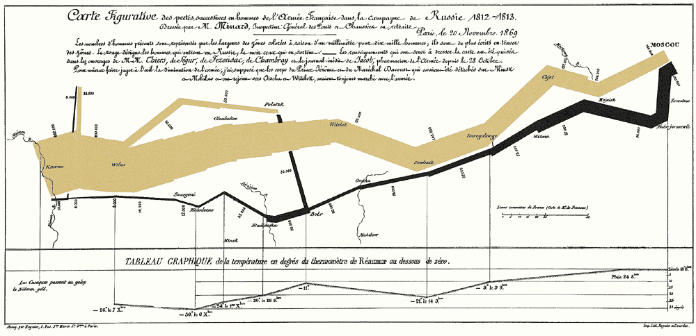
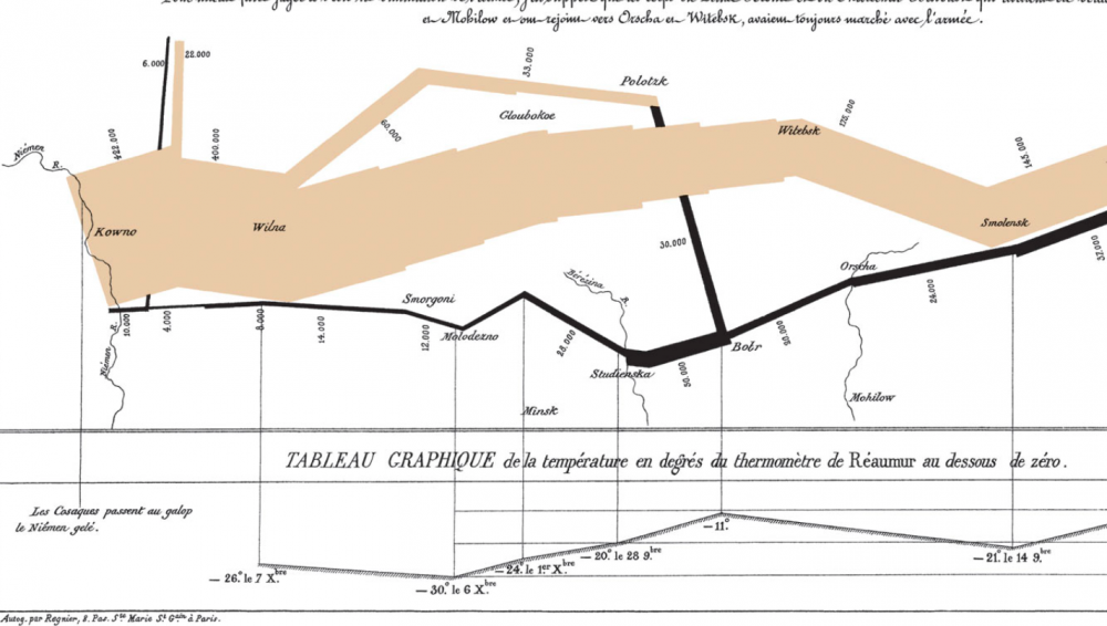
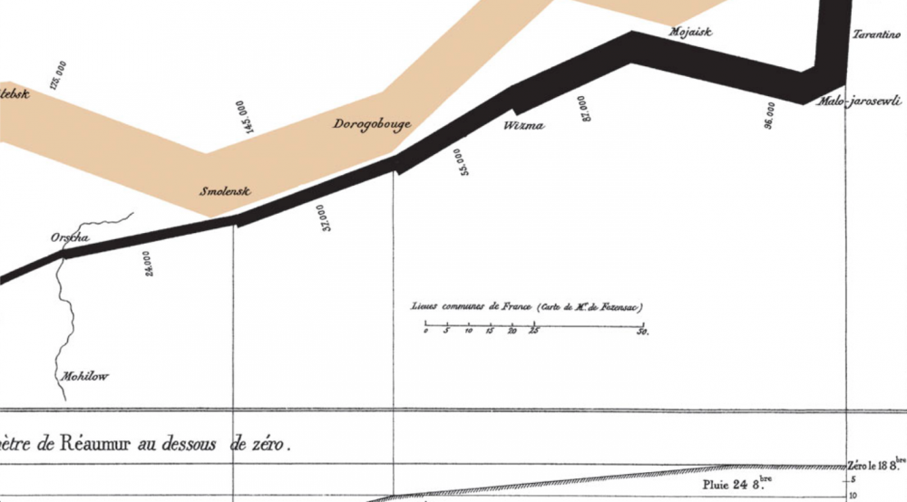
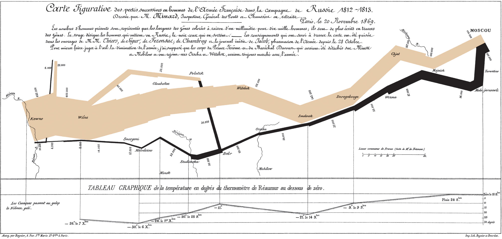
It’s tempting to associate data visualizations with PowerPoint and online graphics, which have enabled an unheard-of capacity for disseminating full-color images. But the form reaches much further back in history. Further back, even, than the front pages of USA Today and glossy sidebars of Time and Almost fifty years before Du Bois turned statistics into swirls of color and shape, Florence Nightingale used her little-known graphic design skills to illustrate the causes of disease in the Crimean War and John Snow (not Jon Snow) illustrated his revolutionary Broad Street Pump cholera theory with a famous infographic street map. Around this same time, another data visualization pioneer, Charles Joseph Minard, produced some of the most highly-regarded infographics ever made, including the 1869 illustration above of Napoleon’s march to, and retreat from, Moscow in the War of 1812. View it in a large format here.
Made fifty years after the event, when Minard was 80 years old, the map has been called by the bible of data visualization studies—Edward Tufte’s The Visual Display of Quantitative Information—“probably the best statistical graphic ever drawn.” Over at thoughtbot.com, Joanne Cheng sums up the context, if you needed a historical refresher: “The year is 1812 and Napoleon is doing pretty well for himself. He has most of Europe under his control, except for the UK.” Angered by Czar Alexander’s refusal to support a UK trade embargo to weaken their defenses, Napoleon “gathers a massive army of over 400,000 to attack Russia.” The campaign was disastrous: overconfident advances on Moscow turned into devastating wintertime retreats during which the Grande Armée only “narrowly escaped complete annihilation.” So, how does Minard’s 1869 Tableau Graphique tell this grand story of hubris and icy carnage? And, Cheng asks, “what makes it so good?” Cheng breaks Minard’s series of jagged lines and shapes down into more conventional XY axis line graphs to show how he coordinated a huge amount of information, including the locations (by longitude) of different groups of Napoleon’s troops at different points in time, their direction, and the precipitously falling temperatures in the stages of retreat. He drew from a list of the best historical sources he could consult at the time, turning dense prose into the spare, clean lines that set data scientists’ hearts a-flutter.
Minard began his career in a much more recognizably 19-century design field, building bridges, dams, and canals across Europe for the first few decades of the 1800s. As a civil engineer “he had the good fortune to take part in almost all the great questions of public works which ushered in our century,” noted an obituary published in Annals of Bridges and Roads the year after Minard’s death in 1870. “And during the twenty years of retirement, always au courant of the technical and economic sciences, he endeavored to popularize the most salient results.” He did so by venturing outside the subject of engineering, while using the “innovative techniques he had invented for the purpose of displaying flows of people” on paper, writes Michael Sandberg at DataViz. In order to tell the tragic tale” of Napoleon’s crushing defeat “in a single image,” Minard imagined the event as a dynamic physical structure.
This was hardly Minard’s first infographic. In fact, he made “scores of other graphics and charts,” National Geographic writes, “as well as nearly 50 maps. He pioneered several important thematic mapping techniques and perfected others, such as using flow lines on a map.” (See other examples of his work at National Geographic’s site.) Minard may not be much remembered for his infrastructure, but his ability, as his obituarist wrote, to turn “the dry and complicated columns of statistical data” into “images mathematically proportioned” has made him a legend in data science history circles. Again, view Minard's visualization of Napoleon's failed invasion in a large format here. Related Content: Florence Nightingale Saved Lives by Creating Revolutionary Visualizations of Statistics (1855) Josh Jones is a writer and musician based in Durham, NC. Follow him at @jdmagness Napoleon’s Disastrous Invasion of Russia Detailed in an 1869 Data Visualization: It’s Been Called “the Best Statistical Graphic Ever Drawn” is a post from: Open Culture. Follow us on Facebook, Twitter, and Google Plus, or get our Daily Email. And don't miss our big collections of Free Online Courses, Free Online Movies, Free eBooks, Free Audio Books, Free Foreign Language Lessons, and MOOCs. |
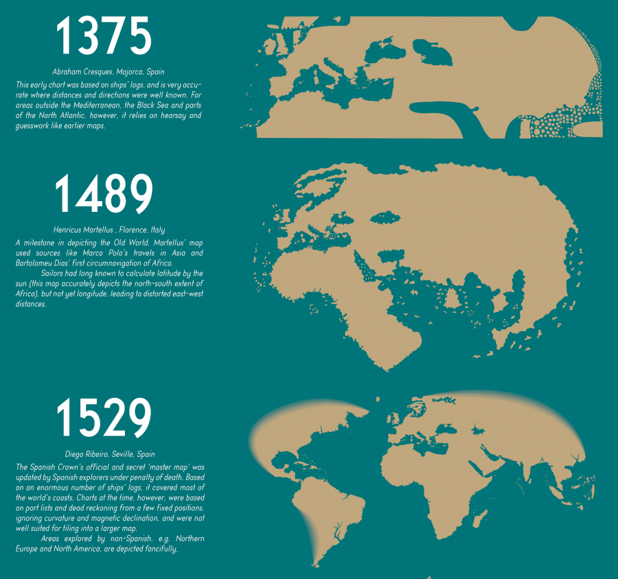
| 11:00a | The Evolution of the World Map: An Inventive Infographic Shows How Our Picture of the World Changed Over 1,800 Years
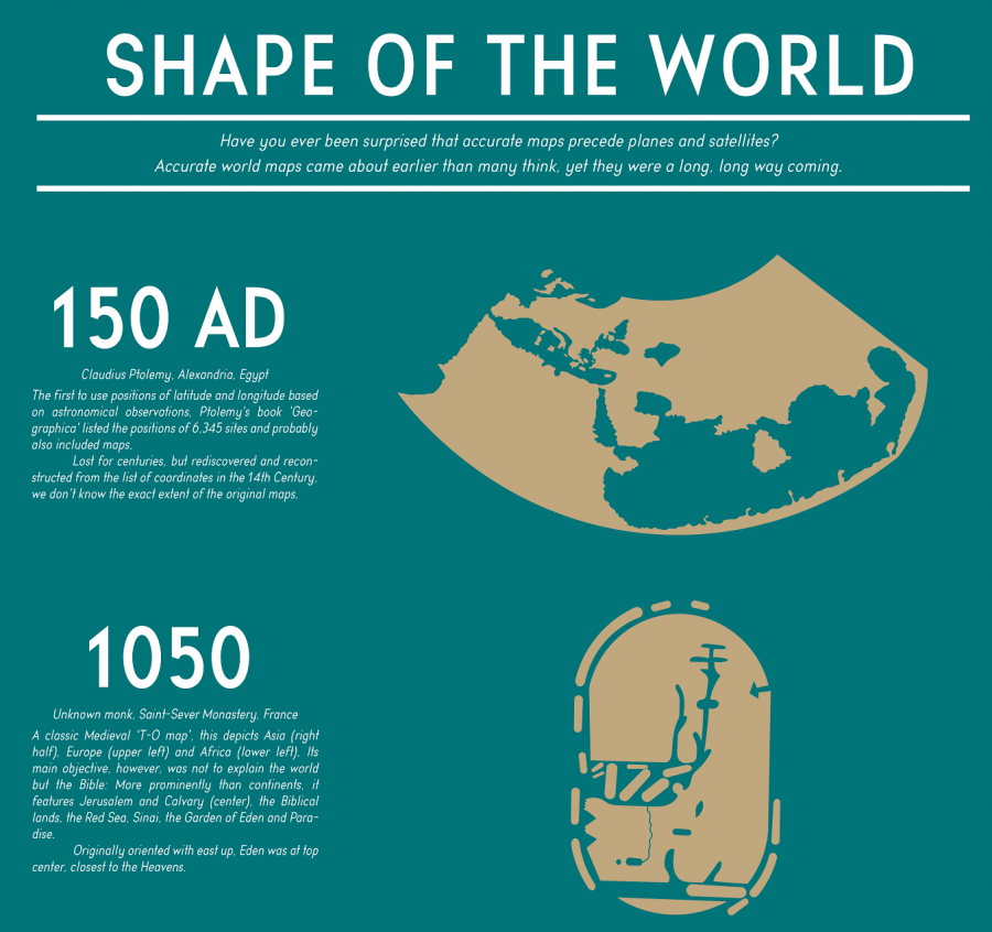
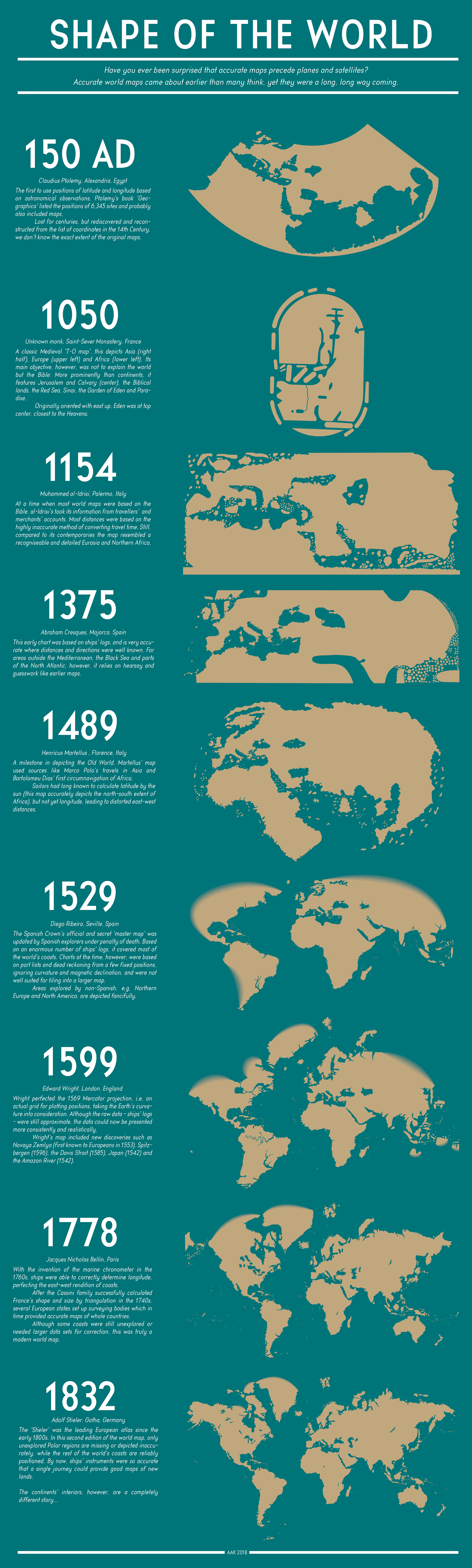
For about 190 years, humanity has known what the world looks like. Or rather, humanity has known the shape and size of the land masses that rise up above the oceans, as well as where those land masses stand in relation to one another. For generation upon generation, we've all grown up seeing visual depictions of this knowledge in the form of the standard world map — distorted, of course, usually by Mercator projection, given the impossibility of turning a three-dimensional globe into a two-dimensional image with perfect accuracy. We can call it to mind (or up on our phones) whenever we need it. But what did the world look like before we knew what it looked like? Thanks to a Redditor who goes by PisseGuri82, we can now take in, at a glance, humanity's image of the world as it evolved over the past two millennia. This Shape of the World infographic begins in 150 AD with the world map used by Claudius Ptolemy of Alexandria, Egypt, "the first to use positions of latitude and longitude based on astronomical observations." Not that those observations produced anything immediately resembling an ancestor of the map we remember from classroom walls growing up, but it certainly must have marked an improvement on the guesswork and pure fantasy used in even earlier times. World maps from the medieval period, such as the one included on the diagram created by an unknown French monk in 1050, were meant "not to explain the world but the Bible." Hence its focus on such Biblical parts of the world as Jerusalem, the Red Sea, and even the Garden of Eden.
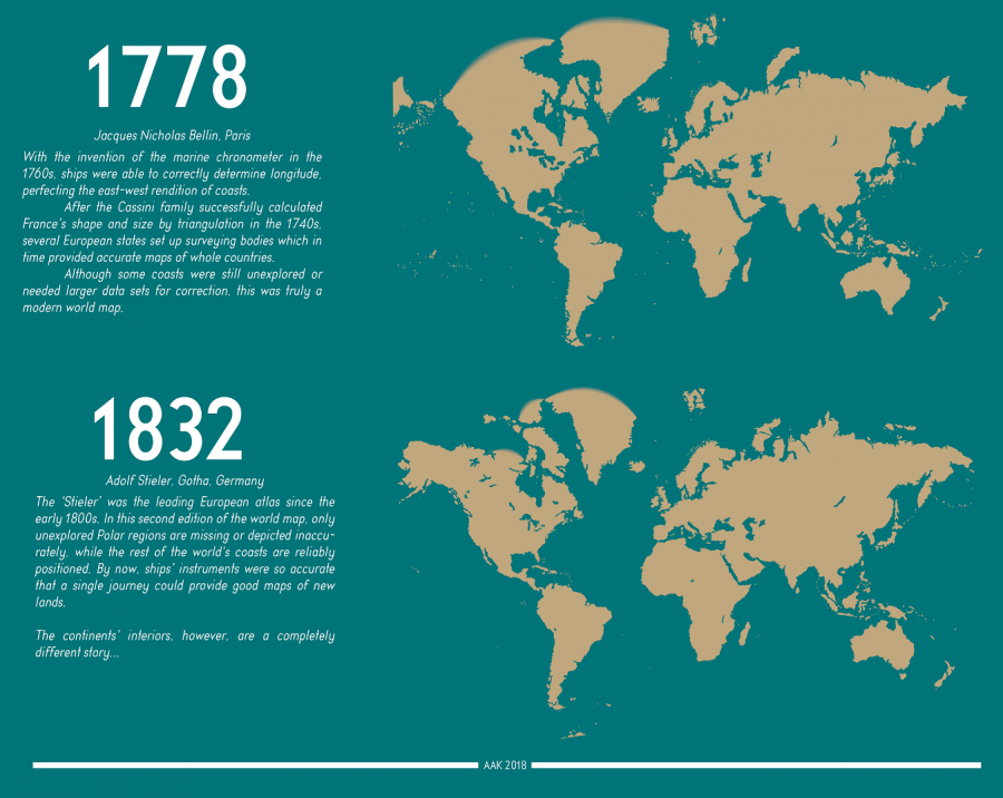
Just over a century later, a map by Italy's Muhammed al-Idrisi employed the more objective method of calculating distances by what travelers and merchants told him about how long it took them to reach the distant lands they visited. Despite its "recognizable and detailed Eurasia and Northern Africa," however, it still makes for a vague (and, needless to say, hardly complete) approximation of the world. Only in 1529, with the empire-minded Spanish Crown's official and secret "master map," updated "by Spanish explorers on pain of death," do we arrive at a world map that would remind any of us of the ones we use in the 21st century. Subsequent developments came from such advances as the aforementioned Mercator projection, invented in 1569 in the Netherlands and refined in England 30 years later, as well as the invention of the marine chronometer in 1778. The final map in the chart, an 1832 edition by Germany's Adolf Stieler in which "only the unexplored Polar regions are missing or depicted inaccurately," may look almost exactly like the world maps we use today. But the evolution certainly hasn't stopped: with the ever more detailed digital maps and satellite imagery that now feature in our world maps, our ability to perceive the Earth still improves every day. Our descendants 2000 years hence may well place themselves in a world we would hardly recognize. See the full-size "Shape of the World" infographic here. Make sure you click on the image once you open the page, and then you can see it in a larger format.
Related Content: Animated Maps Reveal the True Size of Countries (and Show How Traditional Maps Distort Our World) Japanese Designers May Have Created the Most Accurate Map of Our World: See the AuthaGraph The History of Cartography, the “Most Ambitious Overview of Map Making Ever,” Now Free Online A Radical Map Puts the Oceans – Not Land – at the Center of Planet Earth (1942) Why Making Accurate World Maps Is Mathematically Impossible Based in Seoul, Colin Marshall writes and broadcasts on cities, language, and culture. His projects include the book The Stateless City: a Walk through 21st-Century Los Angeles and the video series The City in Cinema. Follow him on Twitter at @colinmarshall, on Facebook, or on Instagram. The Evolution of the World Map: An Inventive Infographic Shows How Our Picture of the World Changed Over 1,800 Years is a post from: Open Culture. Follow us on Facebook, Twitter, and Google Plus, or get our Daily Email. And don't miss our big collections of Free Online Courses, Free Online Movies, Free eBooks, Free Audio Books, Free Foreign Language Lessons, and MOOCs. |
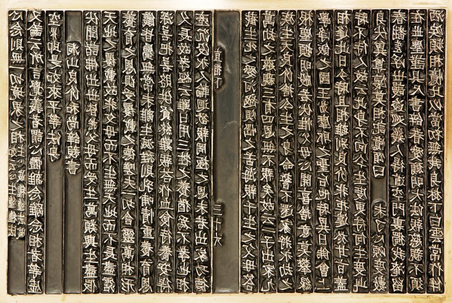
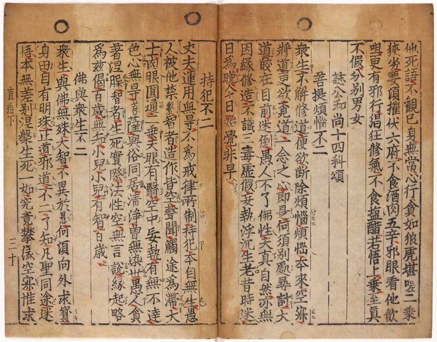
| 5:14p | The Oldest Book Printed with Movable Type is Not The Gutenberg Bible: Jikji, a Collection of Korean Buddhist Teachings, Predated It By 78 Years and It’s Now Digitized Online
The history of the printed word is full of bibliographic twists and turns, major historical moments, and the significant printing of books now so obscure no one has read them since their publication. Most of us have only the sketchiest notion of how mass-produced printed books came into being—a few scattered dates and names. But every schoolchild can tell you the first book ever printed, and everyone knows the first words of that book: “In the beginning….” The first Gutenberg Bible, printed in 1454 by Johannes Gutenberg, introduced the world to movable type, history tells us. It is “universally acknowledged as the most important of all printed books,” writes Margaret Leslie Davis, author of the recently published The Lost Gutenberg: The Astounding Story of One Book’s Five-Hundred-Year Odyssey. In 1900, Mark Twain expressed the sentiment in a letter “commenting on the opening of the Gutenberg Museum,” writes M. Sophia Newman at Lithub. “What the world is to-day,” he declared, “good and bad, it owes to Gutenberg. Everything can be traced to this source.” There is kind of an oversimplified truth in the statement. The printed word (and the printed Bible, at that) did, in large part, determine the course of European history, which, through empire, determined the course of global events after the “Gutenberg revolution.” But there is another story of print entirely independent of book history in Europe, one that also determined world history with the preservation of Buddhist, Chinese dynastic, and Islamic texts. And one that begins “before Johannes Gutenberg was even born,” Newman points out.
The oldest extant text ever printed with movable type predates Gutenberg himself (born in 1400) by 23 years, and predates the printing of his Bible by 78 years. It is the Jikji, printed in Korea, a collection of Buddhist teachings by Seon master Baegun and printed in movable type by his students Seok-chan and Daijam in 1377. (Seon is a Korean form of Chan or Zen Buddhism.) Only the second volume of the printing has survived, and you can see several images from it here. Impressive as this may be, the Jikji does not have the honor of being the first book printed with movable type, only the oldest surviving example. The technology could go back two centuries earlier. Margaret Davis nods to this history, Newman concedes, writing that “movable type was an 11th century Chinese invention, refined in Korea in 1230, before meeting conditions in Europe that would allow it to flourish.” This is more than most popular accounts of the printed word say on the matter, but it's still an inaccurate and highly cursory summary of the evidence.
Newman herself says quite a lot more. In essays at Lithub and Tricycle, she describes how printing techniques developed in Asia and were taken up in Korea in the 1200s by the Goryeo dynasty, who commissioned a printer named Choe Yun-ui to reconstruct a woodblock print of the massive collection of ancient Buddhists texts called the Tipitaka after the Mongols burned the only Korean copy. By casting “individual characters in metal” and arranging them in a frame—the same process Gutenberg used—he was able to complete the project by 1250, 200 years before Gutenberg’s press. This text, however, did not survive, nor did the countless number of others printed when the technology spread across the Mongol empire on the Silk Road and took root with the Muslim Uyghurs. It is possible, though “no clear historical evidence” yet supports the contention, that movable type spread to Europe from Asia along trade routes. “If there was any connection,” wrote Joseph Needham in Science and Civilization in China, “in the spread of printing between Asia and the West, the Uyghurs, who used both block printing and movable type, had good opportunities to play an important role in this introduction.”
Without surviving documentation, this early history of printing in Asia relies on secondary sources. But “the entire history of the printing press" in Europe" is likewise "riddled with gaps,” Newman writes. What we do know is that Jikji, a collection of Korean Zen Buddhist teachings, is the world’s oldest extant book printed with movable type. The myth of Johannes Gutenberg as “a lone genius who transformed human culture,” as Davis writes, “endures because the sweep of what followed is so vast that it feels almost mythic and needs an origin story to match." But this is one inventive individual in the history of printing, not the original, godlike source of movable type. Gutenberg makes sense as a convenient starting point for the growth and worldwide spread of capitalism and European Christianity. His innovation worked much faster than earlier systems, and others that developed around the same time, in which frames were pressed by hand against the paper. Flows of new capital enabled the rapid spread of his machine across Europe. The achievement of the Gutenberg Bible is not diminished by a fuller history. But "what gets left out” of the usual story, as Newman tells us in great detail, “is startlingly rich.” “Only very recently, mostly in the last decade” has the long history of printing in Asia been “acknowledged at all” in popular culture, though scholars in both the East and West have long known it. Korea has regarded Jikji "and other ancient volumes as national points of pride that rank among the most important of books.” Yet UNESCO only certified Jikji as the “oldest movable metal type printing evidence” in 2001. The recognition may be late in coming, but it matters a great deal, nonetheless. Learn much more about the history, content, and provenance of Jikji at this site created by “cyber diplomats” in Korea after UNESCO bestowed World Heritage status on the book. And see a fully digitized copy of the book here. via Lithub Related Content: Oxford University Presents the 550-Year-Old Gutenberg Bible in Spectacular, High-Res Detail Josh Jones is a writer and musician based in Durham, NC. Follow him at @jdmagness The Oldest Book Printed with Movable Type is Not The Gutenberg Bible: Jikji, a Collection of Korean Buddhist Teachings, Predated It By 78 Years and It’s Now Digitized Online is a post from: Open Culture. Follow us on Facebook, Twitter, and Google Plus, or get our Daily Email. And don't miss our big collections of Free Online Courses, Free Online Movies, Free eBooks, Free Audio Books, Free Foreign Language Lessons, and MOOCs. |
| << Previous Day |
2019/07/11 [Calendar] |
Next Day >> |