[Most Recent Entries] [Calendar View]
Wednesday, November 6th, 2019
- "Stephen King Has Spent Half a Century Scaring Us, but His Legacy Is So Much More Than Horror" by Aja Romano
- "Is Stephen King a Great Writer?" by Jane Ciabattari
- "Stephen King Responds to Controversy Surrounding Excluded ‘IT’ Child Orgy Scene" by Helen Meriel Thomas
- "This Stephen King Novel Will Never Be Printed Again After It Was Tied To School Shootings" by Corey Adwar
| Time | Event |
| 8:01a | Pretty Much Pop #18 Discusses Stephen King’s Media Empire 
Is the most popular writer of our time actually a good writer? Or maybe he used to be good but has long since run out of inspiration? What are the most effective ways to adapt these very readable short stories and novels? Does showing us the evil in a film lessen its impact? While you've been thinking about those questions, King has already written another book. Mark Linsenmayer, Erica Spyres, and Brian Hirt share their experiences with and opinions about King's oeuvre and the films and shows that have come out of it, including It, "The Body" (aka Stand By Me), The Shining, In the Tall Grass, The Dark Tower, The Stand, Children of the Corn, From a Buick 8, Under the Dome, The Outsider, Mr. Mercedes, Castle Rock, Pet Sematary, Misery, The Shawshank Redemption, and more. Some articles we read to prepare for this discussion include: If you've never actually read a Stephen King novella, go ahead and read "The Body." This episode includes bonus discussion that you can only hear by supporting the podcast at patreon.com/prettymuchpop. This podcast is part of the Partially Examined Life podcast network. Pretty Much Pop: A Culture Podcast is the first podcast curated by Open Culture. Browse all Pretty Much Pop posts or start with the first episode.
Pretty Much Pop #18 Discusses Stephen King’s Media Empire is a post from: Open Culture. Follow us on Facebook, Twitter, and Google Plus, or get our Daily Email. And don't miss our big collections of Free Online Courses, Free Online Movies, Free eBooks, Free Audio Books, Free Foreign Language Lessons, and MOOCs. |
| 9:00a | Behold Félix Nadar’s Pioneering Photographs of the Paris Catacombs (1861)
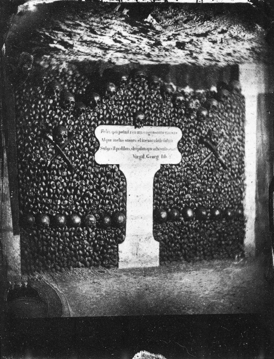
As a tourist in England, one may be persuaded to pick a piece of merchandise with the now-ubiquitous slogan “Keep Calm and Carry On,” from a little-displayed World War II motivational poster rediscovered in 2000 and turned into the 21st-century's most cheeky emblem of stiff-upper-lip-ness. Travel across the Channel, however, and you’ll find another version of the sentiment, drawn not from war memorabilia but the ancient warning of memento mori. “Keep Calm and Remember You Will Die” say magnets, key chains, and other souvenirs emblazoned with the logo of the Paris Catacombs, a major tourist attraction that sells timed tickets “to manage the large queue that forms daily outside the nondescript entrance on the Place Denfert-Rochereau (formerly called the Place d’Enfer, or Hell Square),” writes Allison Meier at Public Domain Review. Still profoundly creepy, the Catacombs were once as forbidding to descend into as their walls of skulls and bones are to gaze upon, requiring visitors to carry flaming torches into their depths.
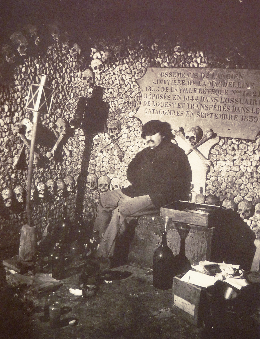
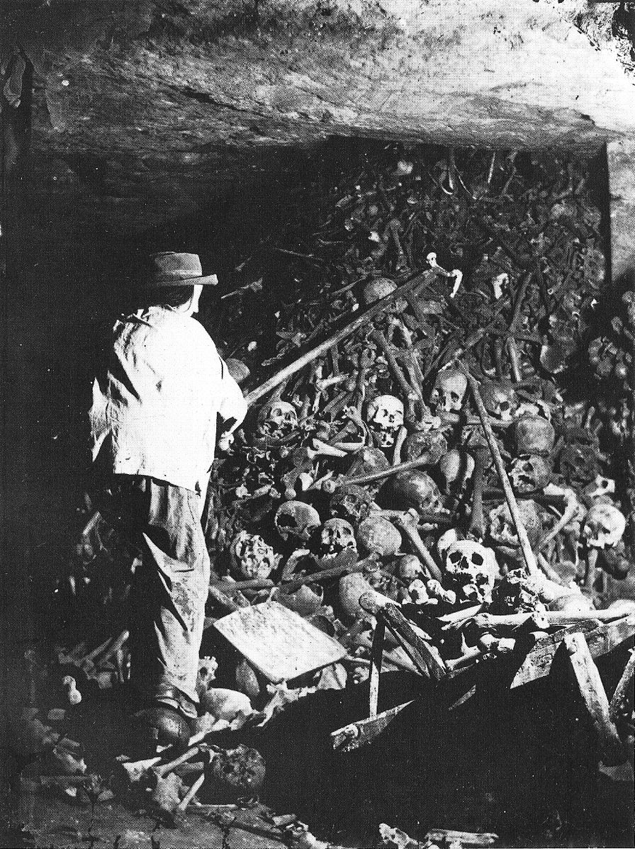
When pioneering photographer Félix Nadar “descended into this ‘empire of death’ in the 1860s artificial lighting was still in its infancy.” Using Bunsen batteries “and a good deal of patience,” Nadar captured the Catacombs as they had never been seen. He also documented the completion of “artistic facades” of skulls and long bones, built “to hide piles of other bones,” notes Strange Remains, from an estimated six million corpses exhumed from overcrowded Parisian cemeteries in the 18th and 19th centuries. Nadar (the pseudonym of Gaspard-Félix Tournachon, born 1820), helped turn the Catacombs into the globally famous destination they became. His “subterranean photographs,” writes Matthew Gandy in The Fabric of Space: Water, Modernity, and the Urban Imagination, “played a key role in fostering the growing popularity of sewers and catacombs among middle-class Parisians, and from the 1867 Exposition onward the city authorities began offering public tours of underground Paris.” The Catacombs became, in Nadar's own words, "one of those places that everyone wants to see and no one wants to see again."
Visitors came seeking the grim fascinations they had seen in Nadar’s photos, taken during a “single three-month campaign,” Meier notes, sometime in 1861, after the photographer “pioneered new approaches to artificial light.” The project was an irresistible photographic essay on the leveling force of mortality. In an essay titled “Paris Above and Below,” published in the 1867 Exposition guide, Nadar described the “egalitarian confusion of death,” in which “a Merovingian king remains in eternal silence next to those massacred in September ’92.”
The ancient and the modern dead, peasants, aristocrats, victims of the Revolutionary terror all piled together, “every trace implacably lost in the unaccountable clutter of the most humble, the anonymous.” The huge necropolis initially had no shape or order. Its 19th century redesign reflected that of the Parisian streets above. In 1810, Napoleon authorized quarries inspector Héricart de Thury to undertake a renovation that accounted for what Thury called “the intimate rapport that will surely exist between the Catacombs and the events of the French Revolution.”
This “rapport” not only included the “mass burial of the victims of the 1792 September Massacres” Nadar references in his essay, but also, Meier points out, the arrangement of bones in “patterns, rows, and crosses; altars and columns were installed below the earth. Plaques with evocative quotations were added to encourage visitors to reflect on mortality.” Because of the long exposure times the photographs required, Nadar used mannequins to stand in for the living workers who completed this work. The only living body he captured was his own, in the self-portrait above.
Learn more about the history of the Catacombs and Nadar’s now-legendary photographic project at Public Domain Review and see many more memento mori images here. Related Content: Notre Dame Captured in an Early Photograph, 1838 Take a Visual Journey Through 181 Years of Street Photography (1838-2019) Josh Jones is a writer and musician based in Durham, NC. Follow him at @jdmagness Behold Félix Nadar’s Pioneering Photographs of the Paris Catacombs (1861) is a post from: Open Culture. Follow us on Facebook, Twitter, and Google Plus, or get our Daily Email. And don't miss our big collections of Free Online Courses, Free Online Movies, Free eBooks, Free Audio Books, Free Foreign Language Lessons, and MOOCs. |
| 12:12p | The Difference Between the United Kingdom, Great Britain and England Explained: A (Pre-Brexit) Video Explains
I once played in a New York pub band with an Englishman, a Northern Irishman, and a Scotsman. This is not the setup for a joke. (We weren't that bad!) But I had questions. Were they all from different countries or different parts of one country called Britain, or Great Britain, or the grander-sounding United Kingdom? British history could be a contentious subject in such company, and no wonder given that the violence of the Empire began at home, or with the neighboring people who were absorbed—sometimes, partly, but not always—against their will into a larger entity. So, what to call that territory of the crown which once claimed one fourth of the world as its own property? CGP Grey, maker of the YouTube explainer above, aims to clear things up in five minutes, offering his own spin on British imperial history along the way. The United Kingdom is a “country of countries that contains inside it four coequal and sovereign nations,” England, Scotland, Wales, and Northern Ireland. “You can call them all British,” says Grey, but “it’s generally not recommended as the four countries generally don’t like each other.” Like it or not, however, they are all British citizens of “The United Kingdom of Great Britain and Northern Ireland.” Still confused? Well, Britain and the United Kingdom name the same country. But “Great Britain” is a geographical term that includes Scotland, England, and Wales, but not Northern Ireland. As a “geographical rather than a political term,” Great Britain sounds silly when used to describe nationality. But it gets a bit more complicated. All of the countries located within Great Britain have neighboring islands that are not part of Great Britain, such as the Hebrides, Shetland and Orkney Islands, and Isles of Anglesey and Wight. Ireland is a geographical term for the land mass encompassing two nations: Northern Ireland, which is part of Britain, or the United Kingdom, and the Republic of Ireland, which—as you know—is decidedly not. All of these countries and “countries of countries” are part of the European Union, says Grey, at which point it becomes clear that the video, posted in 2011, did not anticipate any such thing as Brexit. Nonetheless, this information holds true for the moment, though that ugly saga is sure to reach some resolution eventually, at which point, who knows what new maps, independence referenda, and border wars will arise, or resurrect, on the British Isles. Related Content: The Entire History of the British Isles Animated: 42,000 BCE to Today Watch the Rise and Fall of the British Empire in an Animated Time-Lapse Map ( 519 A.D. to 2014 A.D.) The History of Europe from 400 BC to the Present, Animated in 12 Minutes Josh Jones is a writer and musician based in Durham, NC. Follow him at @jdmagness The Difference Between the United Kingdom, Great Britain and England Explained: A (Pre-Brexit) Video Explains is a post from: Open Culture. Follow us on Facebook, Twitter, and Google Plus, or get our Daily Email. And don't miss our big collections of Free Online Courses, Free Online Movies, Free eBooks, Free Audio Books, Free Foreign Language Lessons, and MOOCs. |
| 3:00p | Comic Sans Turns 25: Graphic Designer Vincent Connare Explains Why He Created the Most Hated Font in the World
What we write reveals who we are, but so, and often more clearly, does how we write. And in an age when handwriting has given way to typing, how we write has much to do with which font we use. Many of us play it safe, rarely straying from the realm of twelve-point Times New Roman hypernormality, but even there "type is a voice; its very qualities and characteristics communicate to readers a meaning beyond mere syntax." That observation comes from the Ban Comic Sans Manifesto, drawn up two decades ago by graphic designers Holly and David Combs as a strike against the font that, 25 years after its creation, remains a hate object of choice for the visually literate everywhere. "You don’t like that your coworker used me on that note about stealing her yogurt from the break room fridge?" asks Comic Sans itself, ventriloquized in McSweeney's by Mike Lacher. "You don’t like that I’m all over your sister-in-law’s blog? You don’t like that I’m on the sign for that new Thai place? You think I’m pedestrian and tacky?" Well, tough: "People love me. Why? Because I’m fun. I’m the life of the party. I bring levity to any situation. Need to soften the blow of a harsh message about restroom etiquette? SLAM. There I am. Need to spice up the directions to your graduation party? WHAM. There again. Need to convey your fun-loving, approachable nature on your business’ website? SMACK." In the Great Big Story video above, Comic Sans creator Vincent Connare tells his side of the story. While employed at Microsoft in the early 1990s, he saw a prototype version of Microsoft Bob, a kind of add-on to the Windows interface designed for maximum user friendliness. It featured onscreen animal characters that spoke in speech bubbles, but the words in those speech bubbles appeared in what was everyone's default font. When it hit him that "dogs don’t talk in Times New Roman," Connare, a graphic-novel fan, got to work on a typeface for the speech bubbles modeled on the lettering by John Costanza in The Dark Knight Returns and by Dave Gibbons in Watchmen.
Comic Sans didn't make it into Microsoft Bob, it did make it into a somewhat more successful Microsoft product: Windows 95, which David Kadavy at Design for Hackers calls "the first operating system to really hit it big. Just as computers were starting to pop up in nearly every home in America, Windows 95 was finding itself installed on all of those computers, and with it, the font Comic Sans. So now, nearly every man, woman, child, and bake sale organizer find themselves armed with publishing power unlike civilization had ever seen; and few of them really had any design sense." Then came the internet boom, which meant that "instead of flyers posted in break rooms, Comic Sans was showing up on websites, and even as the default font for many people’s emails. Now, any one person could write a message that could potentially be read by millions, in Comic Sans." What makes Comic Sans so reviled? Kadavy points to several reasons having to do with typographical aesthetics, including awkward weight distribution ("weight" being the thickness of its lines) and poor letterfit (meaning that its letters don't, or can't, sit well next to each other). But the problem most of us notice is that "Comic Sans isn’t used as intended": A typeface meant only for speech bubbles in Microsoft Bob has somehow become one of the most popular in the world, appearing unsuitably in everything from Cleveland Cavaliers owner Dan Gilbert's open letter on the departure of LeBron James to CERN's announcement of evidence of the Higgs boson particle to, just last month, a letter from Donald Trump's lawyer's to the House Intelligence Committee. Through it all, Connare himself — who has designed such relatively respectable typefaces as Trebuchet, and has famously only used Comic Sans once, in a complaint letter to his cable company — has kept his sense of humor, as evidenced by his talk entitled "Comic Sans Is the Best Font in the World." Even the Combs' movement has changed its name, if not without irony, into "Use Comic Sans." Pieces marking the font's 25th anniversary include "Hating Comic Sans Is Not a Personality" by The New York Times' Emma Goldberg and "In Bad Taste or Not, I’ll Keep My Comic Sans" by The Washington Post's Joseph Epstein (published, entirely and courageously, in Comic Sans). If you love the font, Connare often says, you don't know much about typography, but if you hate it, "you should get another hobby." Besides, the story of Comic Sans also contains an important life lesson: "You have to do things that aren't beautiful sometimes." Related Content: The History of Typography Told in Five Animated Minutes Download Iconic National Park Fonts: They’re Now Digitized & Free to Use How to Write Like an Architect: Short Primers on Writing with the Neat, Clean Lines of a Designer Based in Seoul, Colin Marshall writes and broadcasts on cities, language, and culture. His projects include the book The Stateless City: a Walk through 21st-Century Los Angeles and the video series The City in Cinema. Follow him on Twitter at @colinmarshall, on Facebook, or on Instagram. Comic Sans Turns 25: Graphic Designer Vincent Connare Explains Why He Created the Most Hated Font in the World is a post from: Open Culture. Follow us on Facebook, Twitter, and Google Plus, or get our Daily Email. And don't miss our big collections of Free Online Courses, Free Online Movies, Free eBooks, Free Audio Books, Free Foreign Language Lessons, and MOOCs. |
| 5:44p | Martin Scorsese Explains the Difference Between Cinema and Movies
Image by "Siebbi," Wikimedia Commons There is a battle raging on the internet, and you may count yourself lucky if you’ve heard nothing about it since it involves the usual unnecessary escalations and knee-jerk reactions: the battle of superhero movies versus the art form known as “cinema.” The first shot, one might say, was fired by Martin Scorsese, who has certainly earned the right to make pronouncements on the subject. Asked for his thoughts on the MCU (that’s Marvel Cinematic Universe for the uninitiated) during an interview with Empire magazine, Scorsese opined, “that’s not cinema. Honestly, the closest I can think of them, as well made as they are, with actors doing the best they can under the circumstances, is theme parks.” This writer is of the opinion that one can enjoy film both as art and as pure spectacle, while recognizing clear differences between them. They share a medium, but they aim at and produce different effects. Comparing the experience of watching Avengers: Endgame or most any other Marvel film to riding a rollercoaster seems perfectly apposite to me. Still, comic film fans went wild online, lobbing all sorts of accusations at Scorsese and fellow directors who delivered even less charitable takes on the Marvel movie phenom. Twitter memes and jokes proliferated; Disney’s CEO weighed in with what must surely be a disinterested critical opinion. Let’s look past distracting hot takes, marketing strategies, and generational warfare. Scorsese has eloquently clarified his position in a New York Times op-ed, and his arguments are worth our attention. For one thing, the director approaches the subject with humility, admitting his own biases. “The fact that [Marvel] films don’t themselves interest me is a matter of personal taste and temperament,” he writes. “I know that if I were younger, if I’d come of age at a later time, I might have been excited by these pictures and maybe even wanted to make one myself.” He details his own sense of what cinema should be, one drawn principally from his influences: Bergman, Godard, Hitchcock (whose movies might also be called theme parks in a way, Scorsese grants, but rely more on characterization than grand set pieces and special effects). He also lists current favorites: Ari Aster, Spike Lee, Kathryn Bigelow, Paul Thomas Anderson. As an auteur himself, he has a clear bias in favor of other auteurs. Yet there’s more at stake than taste or what some have seen as elitism. “Why not just let superhero films and other franchise films be?” he asks. “The reason is simple. In many places around this country and around the world, franchise films are now your primary choice if you want to see something on the big screen.” Superhero movies have dominated the market, edging out other kinds of films with other kinds of aspirations. The “financial dominance” of what Scorsese calls “worldwide audiovisual entertainment” is “being used to marginalize and even belittle the existence” of cinema—of smaller films that take creative risks and are not computer-generated products of market research and audience testing for maximum box-office consumption. Having grown up himself in the Hollywood studio system, Scorsese doesn’t dismiss film as a business, but he laments the loss of a “productive tension” between “the artists and the people who ran the business.” Without that tension, the industry becomes an efficient, but inhuman, machine. It’s a problem, in other words, of a power imbalance in which studios—vertically integrated into mega-corporations like Disney—push profit over most other considerations. This severely limits the risks they’re willing to take, and it pushes independent and experimental filmmakers further into the margins, and out of theaters altogether, where their works were meant to be seen. Netflix and other streaming services may open up unique opportunities, but they diminish film by relegating it to television screens (and, worse, tablets and phones). Scorsese’s argument is only partly an aesthetic one—he may object to Marvel movies on the grounds that they’re forgettable and predictable. But the primary concern he voices in his essay is a problem of proportion. The Marvel Cinematic Universe—like the villain in Avengers: Endgame (which Scorsese hasn’t seen)—threatens to take over and half-destroy the universe of cinema in all its variety of forms and expressions. It is largely succeeding. “For anyone who dreams of making movies or who is just starting out, the situation at this moment is brutal and inhospitable to art,” Scorsese writes. “And the act of simply writing those words fills me with terrible sadness.” Read his essay here. Related Content: Martin Scorsese to Teach His First Online Course on Filmmaking Martin Scorsese Makes a List of 85 Films Every Aspiring Filmmaker Needs to See Frank Zappa Explains the Decline of the Music Business (1987) Josh Jones is a writer and musician based in Durham, NC. Follow him at @jdmagness Martin Scorsese Explains the Difference Between Cinema and Movies is a post from: Open Culture. Follow us on Facebook, Twitter, and Google Plus, or get our Daily Email. And don't miss our big collections of Free Online Courses, Free Online Movies, Free eBooks, Free Audio Books, Free Foreign Language Lessons, and MOOCs. |


| << Previous Day |
2019/11/06 [Calendar] |
Next Day >> |